

Raw Sales Mask True Store Efficiency
A $2 million store sounds twice as productive as a $1 million store — until you account for the labor each requires to produce those results. SPLH sales benchmarking transforms how you evaluate location performance, revealing which stores run efficiently and which merely benefit from size or foot traffic.
Large-format stores accumulate higher raw revenue
A flagship store in a high-traffic district generates strong quarterly sales while a mid-sized location in a quieter area posts more modest returns for the same period. At first glance, the flagship appears far more productive. In reality, the flagship occupies far more square footage, staffs a larger payroll, and benefits from foot traffic that smaller locations never see. The higher sales figure reflects real estate and location, not better scheduling or smarter labor deployment.
Mid-sized and smaller locations are chronically undervalued when benchmarked against flagship stores using gross sales metrics. Store managers running efficient teams in lower-traffic formats watch their performance reviews penalize them for factors outside their control. The P&L tells a different story when you isolate what the team actually controls: how much revenue each labor hour produces, regardless of store size or foot traffic patterns.
Comparing stores by raw revenue creates false hierarchies
When a district manager ranks locations by total sales, the biggest store wins every time—even if it runs inefficiently. A spacious location with strong weekly revenue looks better on paper than a compact store with modest performance, but that comparison hides what matters: the smaller store may be generating far more value per labor hour invested.
This false hierarchy shapes staffing budgets in ways that punish efficient operations and reward scale alone, driving hours toward large stores that may already be overstaffed while starving lean teams that deliver stronger returns on every shift.
SPLH Calculation and Interpretation
The formula is simple: SPLH equals total sales divided by total labor hours worked during the same period. If your store generated $150,000 in sales over a four-week period and your team logged 1,200 labor hours, your SPLH is $125. That single number tells you that every hour of labor investment produced $125 in revenue.
Pull your sales total from your POS system for the period you're analyzing—most operators measure this monthly or by retail calendar period (4-4-5 blocks). For labor hours, go to your payroll system or scheduling platform and sum all hours worked by every hourly employee: full-time, part-time, seasonal, everyone who clocked in. Exclude salaried managers if you want to measure pure hourly productivity, though some operators include all labor for a complete picture. The key is consistency—measure the same way every period and across every location.
SPLH isolates efficiency by normalizing for staffing investment. A store that generates $500,000 in sales with 4,000 labor hours ($125 SPLH) is operationally identical to a store that generates $200,000 with 1,600 hours—same efficiency, different scale. This is why SPLH is the fairest metric for comparing store locations of vastly different sizes. Raw sales favor the big box; SPLH reveals who's actually running a tight operation.
Higher SPLH is always better. It means you're generating more revenue per dollar spent on labor, which flows directly to your four-wall P&L. A manager who improves SPLH while maintaining service hours has just made the store more profitable.
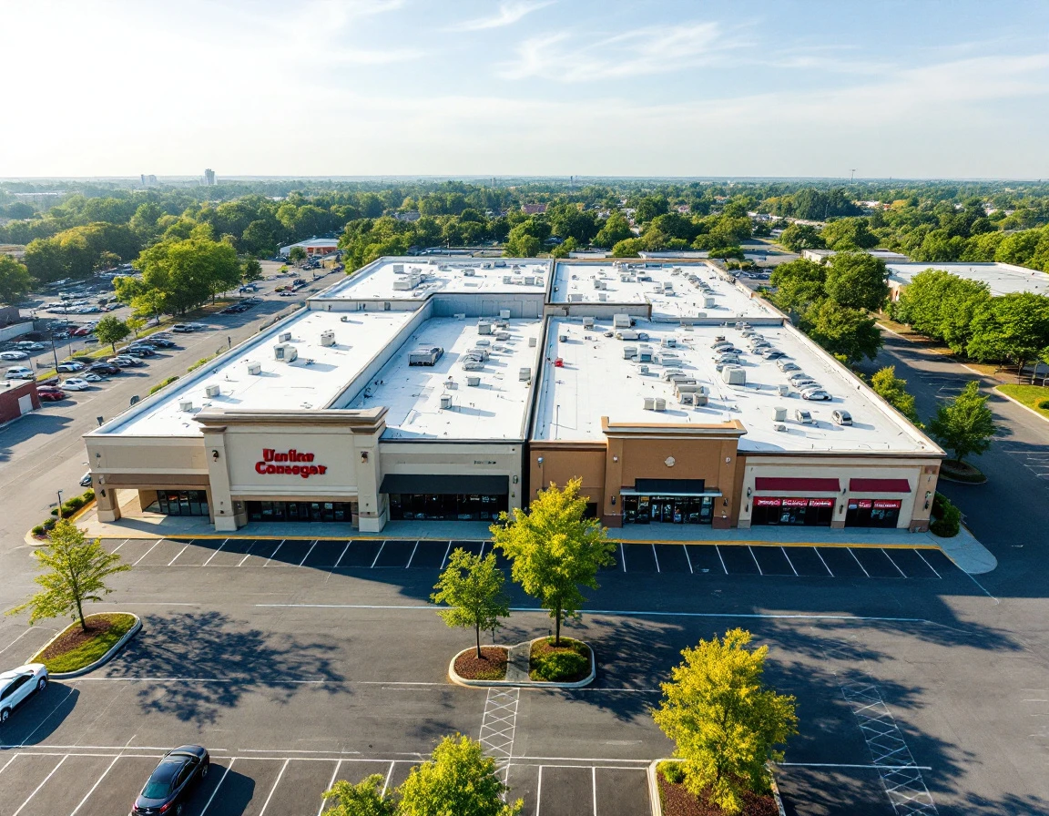
How to Benchmark Store Locations by Size Category
Comparing a 7,000 square foot location to a 35,000 square foot flagship using the same SPLH target ignores everything that makes retail operations different at different scales. A smarter approach is to create peer groups — segment your stores by square footage, customer traffic tier, or sales volume band — and compare performance only within those categories.
Start by grouping locations into brackets:
- Under 5,000 sq ft
- 5,000–15,000 sq ft
- 15,000–30,000 sq ft
- Over 30,000 sq ft
Within each group, calculate the median SPLH from internal historical data — three to six months is usually enough — and set that as your benchmark. If you have access to anonymized industry data for similar formats. Layer it in to confirm your ranges are realistic. The result is a set of category-specific targets that reflect the operational reality of each store size.
Regional and format variations matter, too. A 10,000 sq ft urban store with high foot traffic but smaller transaction sizes will generate different SPLH than a 10,000 sq ft suburban store with fewer visits but larger baskets. Group by traffic pattern or format alongside square footage to keep comparisons fair, which is the foundation of fair store benchmarking methodology.
Here's how this protects managers: imagine your 8,000 sq ft location delivers $145 SPLH while the chain average is $160. That looks weak until you zoom into the 5,000–15,000 sq ft category, where the median is $138. Suddenly your store is outperforming its peer group by five percent. A fact that vindicates your team in mid-year reviews even though raw sales lag the flagship. You've removed the handicap smaller locations face and revealed the genuine efficiency gap — or lack of one.

SPLH and Staffing Decisions
Every manager facing a mid-year review knows the question: are we overstaffed, understaffed, or right-sized? SPLH diagnostics answer that question without the guesswork. When SPLH trends upward while revenue holds steady, you're watching efficiency gains—fewer hours generating the same dollars. When SPLH falls despite stable sales, you're looking at excess labor cost, often buried in overlapping shifts or poor daypart coverage patterns.
Consider a metro flagship store where sales per labor hour declined over a three-month period while monthly revenue plateaued. The culprit: schedule creep. Too many overlapping mid-shifts and generous break coverage had inflated the labor budget without lifting sales. Cutting those redundant hours restored efficiency and reduced labor costs. Contrast that with a suburban store where sales per labor hour improved in the same period—same flat revenue, but the manager tightened opening coverage and eliminated a slow Tuesday shift, freeing budget for peak Saturday reinforcement.
July staffing decisions benefit from these comparisons because you're working with six months of data and can see patterns that one or two months hide. A seasonal beach-town store might see SPLH compress in summer as tourist volume demands more hands, and that's expected. The data tells you which locations need adjustment and which are trading efficiently for their traffic pattern. SPLH keeps you from penalizing a well-run smaller store or rewarding a bloated large one based solely on revenue totals.
Building Sustainable SPLH Improvement
SPLH gains last when they come from smarter scheduling. Not indiscriminate hour cuts that erode service and drive customers away. The metric is a diagnostic tool—it reveals where labor is well-matched to demand and where it isn't. Managers who treat SPLH as a target to hit by understaffing create short-term wins that collapse into turnover, missed sales, and burned-out teams. The goal is to align hours with traffic patterns, not to strip coverage below the floor where customer experience breaks down.
Track SPLH monthly during the second half of the year to catch trends before they harden into structural problems. A store that shows declining SPLH from July through September can adjust staffing proactively for Q4 peaks rather than scrambling in November. Monthly tracking turns SPLH into an early-warning system, not a rearview-mirror metric reviewed once a year when it's too late to correct course.
Fair benchmarks by size category change how teams respond to performance data. When managers know they're measured against peers in the same traffic tier, they stop defending weak results by blaming scale—and they stop resenting metrics that were never built for their reality. That shift reduces turnover and lifts morale because the scorecard finally reflects what managers can actually control. SPLH comparison by peer group gives the organization better data to allocate resources where they'll generate the most return. PlannerPuffin turns sales forecasts into labor plans that protect your margin and your coverage at the same time.